BRITO TATTOO - Identidade visual
[PT]
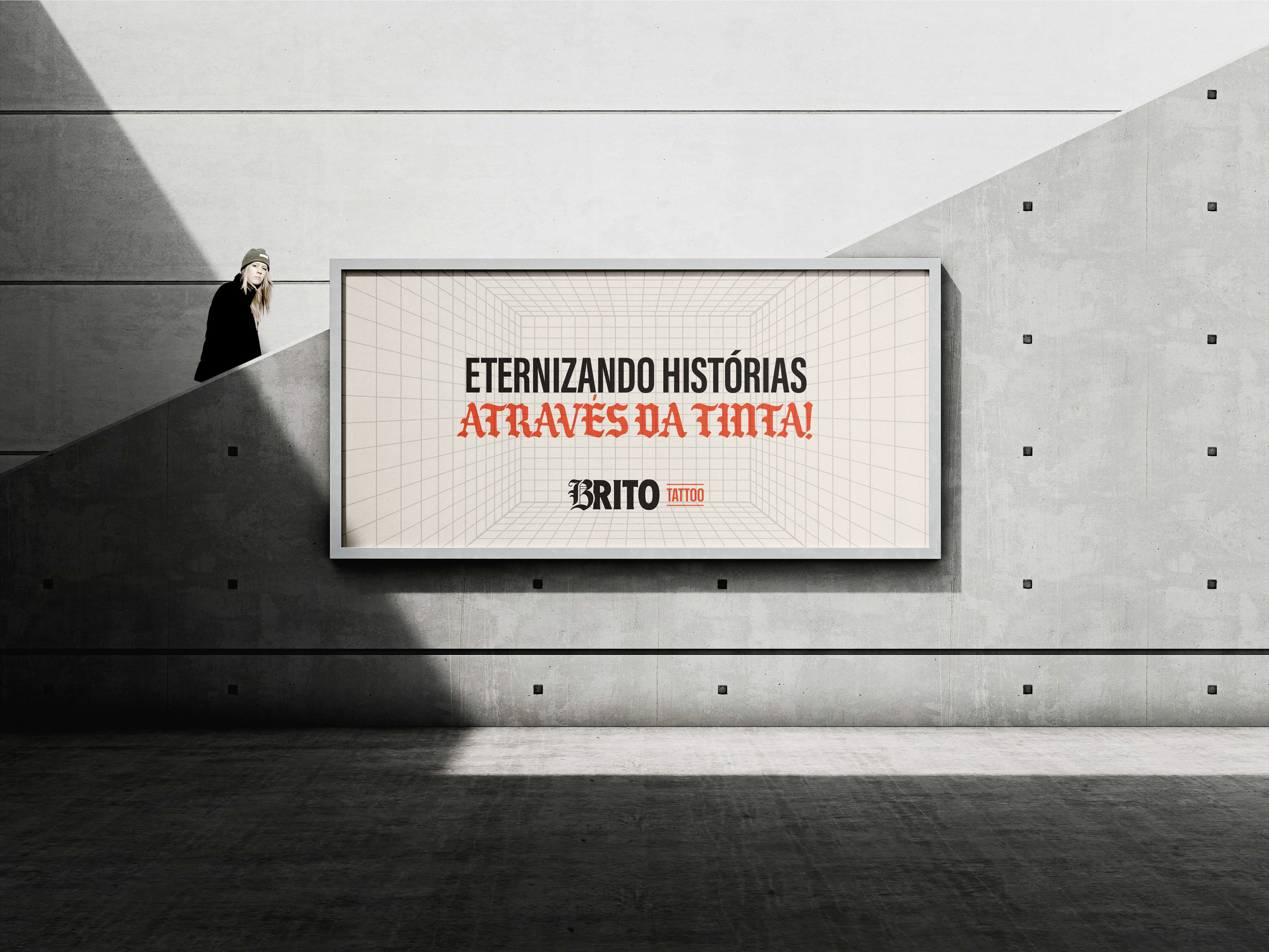
Mais do que tinta. Um espelho da alma.
A Brito Tattoo nasce do desejo de eternizar histórias reais na pele.
Cada traço é fruto de conexão, escuta e verdade.
Este projeto de branding traduz o espírito da marca: ousado, simbólico e humano.
[EN]
More than ink. A mirror of the soul.
Brito Tattoo was born from the desire to eternalize real stories on the skin.
Each stroke is the result of connection, deep listening, and truth.
This branding project captures the spirit of the brand: bold, symbolic, and human.
Brito Tattoo was born from the desire to eternalize real stories on the skin.
Each stroke is the result of connection, deep listening, and truth.
This branding project captures the spirit of the brand: bold, symbolic, and human.
SOBRE
[PT]
Gabriel Brito é tatuador e artista de Recife/PE.
Desde pequeno, a arte sempre foi sua linguagem natural. Curioso, criativo e observador, cresceu desenhando e buscando formas de expressar aquilo que nem sempre cabia em palavras.
Desde pequeno, a arte sempre foi sua linguagem natural. Curioso, criativo e observador, cresceu desenhando e buscando formas de expressar aquilo que nem sempre cabia em palavras.
Com o tempo, a tatuagem se revelou como o espaço onde sua arte ganhava propósito. Mais do que técnica, ali ele encontrou verdade, conexão e transformação. A pele virou tela. E cada cliente, uma nova história a ser ouvida e eternizada.
Foi assim que nasceu a Brito Tattoo. Um estúdio autoral, feito para transformar histórias reais em arte permanente. Aqui, não é preciso saber o que tatuar. É preciso estar disposto a compartilhar quem você é. Gabriel escuta com atenção e transforma palavras, memórias e sentimentos em traços cheios de significado.
A identidade visual traduz essa essência. Ela expressa presença, profundidade, rebeldia e ritual. Carrega também a ousadia de quebrar padrões, tanto estéticos quanto simbólicos. A Brito Tattoo é, ao mesmo tempo, ruptura e construção. Técnica e sensibilidade. Instinto e intenção.
Nosso desafio foi transformar tudo isso em marca. E o resultado é uma identidade que respira verdade, carrega alma e deixa sua marca por onde passa.
[EN]
Gabriel Brito is a tattoo artist and visual creator from Recife, Brazil.
Since childhood, art has always been his natural language. Curious, creative, and observant, he grew up drawing and searching for ways to express what words couldn’t contain.
Since childhood, art has always been his natural language. Curious, creative, and observant, he grew up drawing and searching for ways to express what words couldn’t contain.
Over time, tattooing revealed itself as the space where his art gained true purpose. More than technique, it became a place of truth, connection, and transformation. Skin became canvas. And each client, a new story to be heard and eternalized.
That’s how Brito Tattoo was born — an authorial studio created to transform real stories into permanent art.
Here, you don’t need to know what to get tattooed. You just need to be willing to share who you are. Gabriel listens with care and translates words, memories, and feelings into meaningful lines.
Here, you don’t need to know what to get tattooed. You just need to be willing to share who you are. Gabriel listens with care and translates words, memories, and feelings into meaningful lines.
The visual identity captures this essence. It expresses presence, depth, rebellion, and ritual. It also carries the boldness to break patterns — both aesthetic and symbolic. Brito Tattoo is, at the same time, disruption and construction. Technique and sensibility. Instinct and intention.
Our challenge was to turn all of this into a brand. And the result is an identity that breathes truth, carries soul, and leaves its mark wherever it goes.
CONCEITO
[PT]
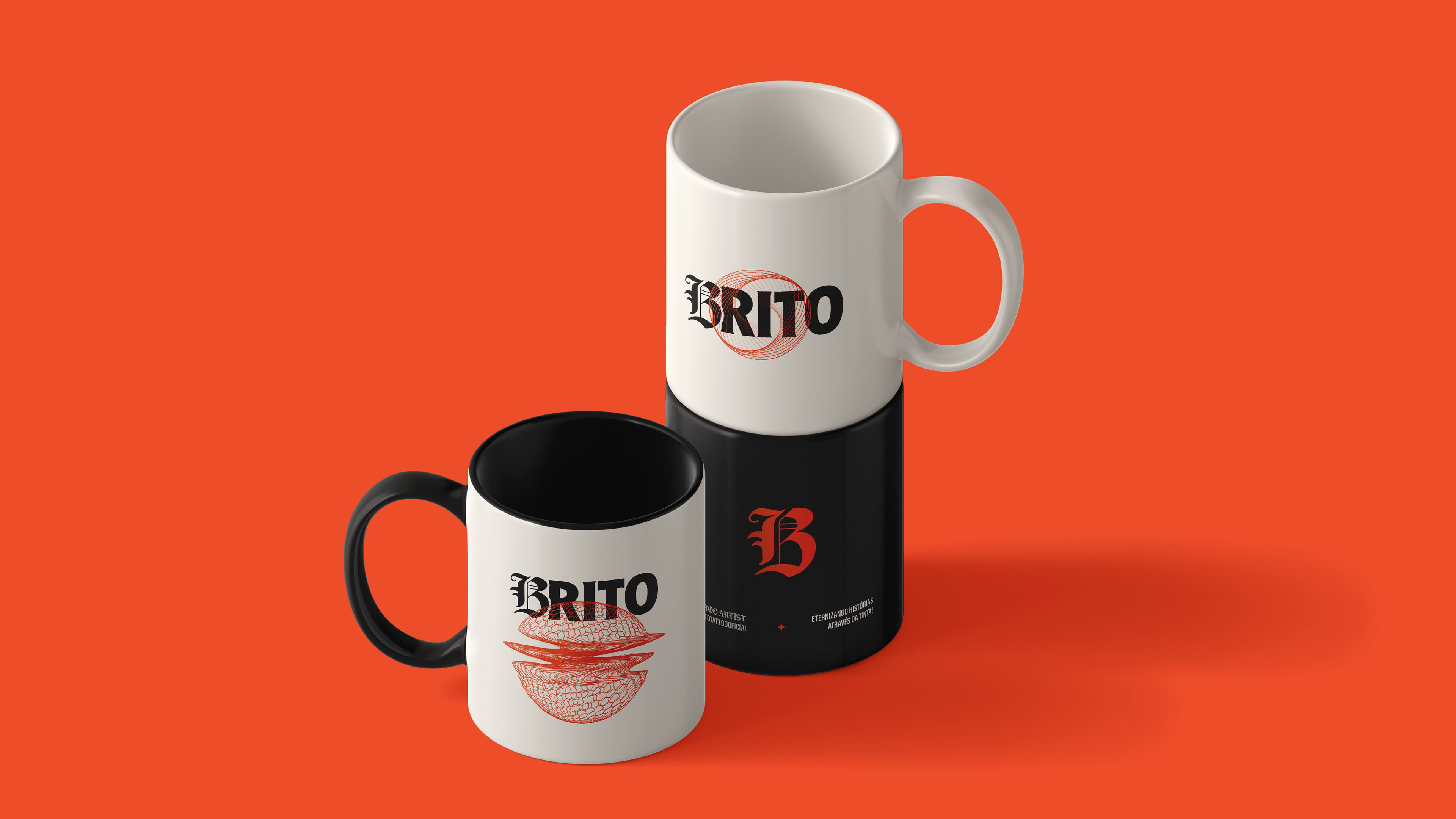
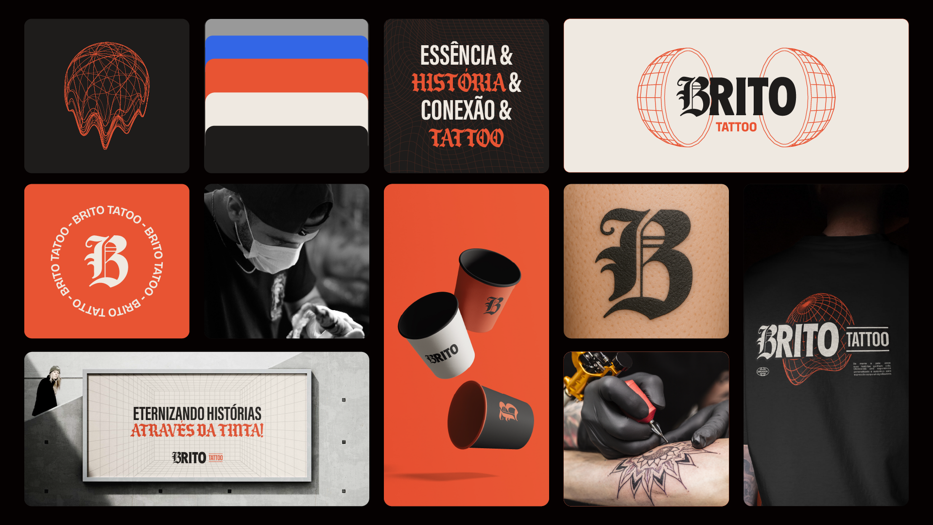
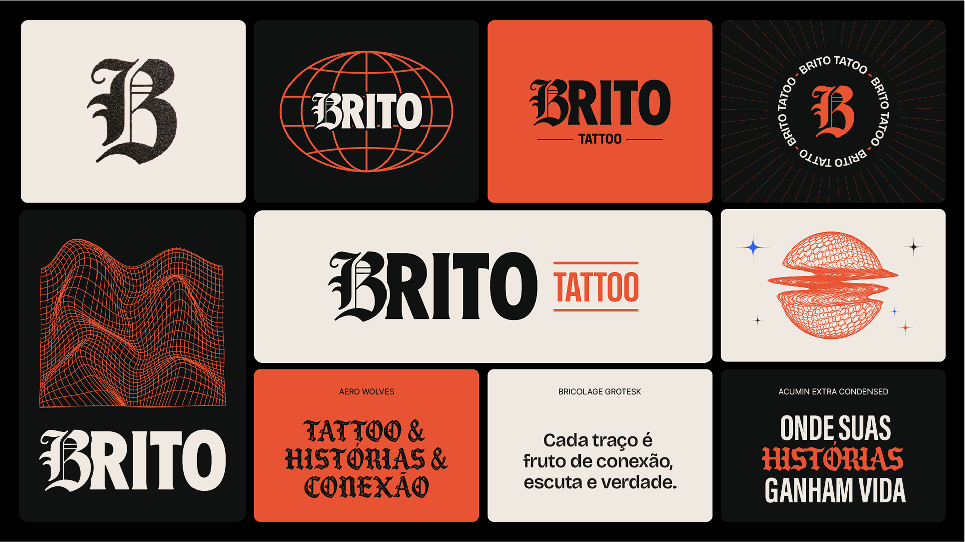
O logotipo da Brito Tattoo nasce do contraste entre dois polos essenciais da marca: o artístico e o racional, o gesto rebelde e a estrutura firme, a expressão e o domínio técnico.
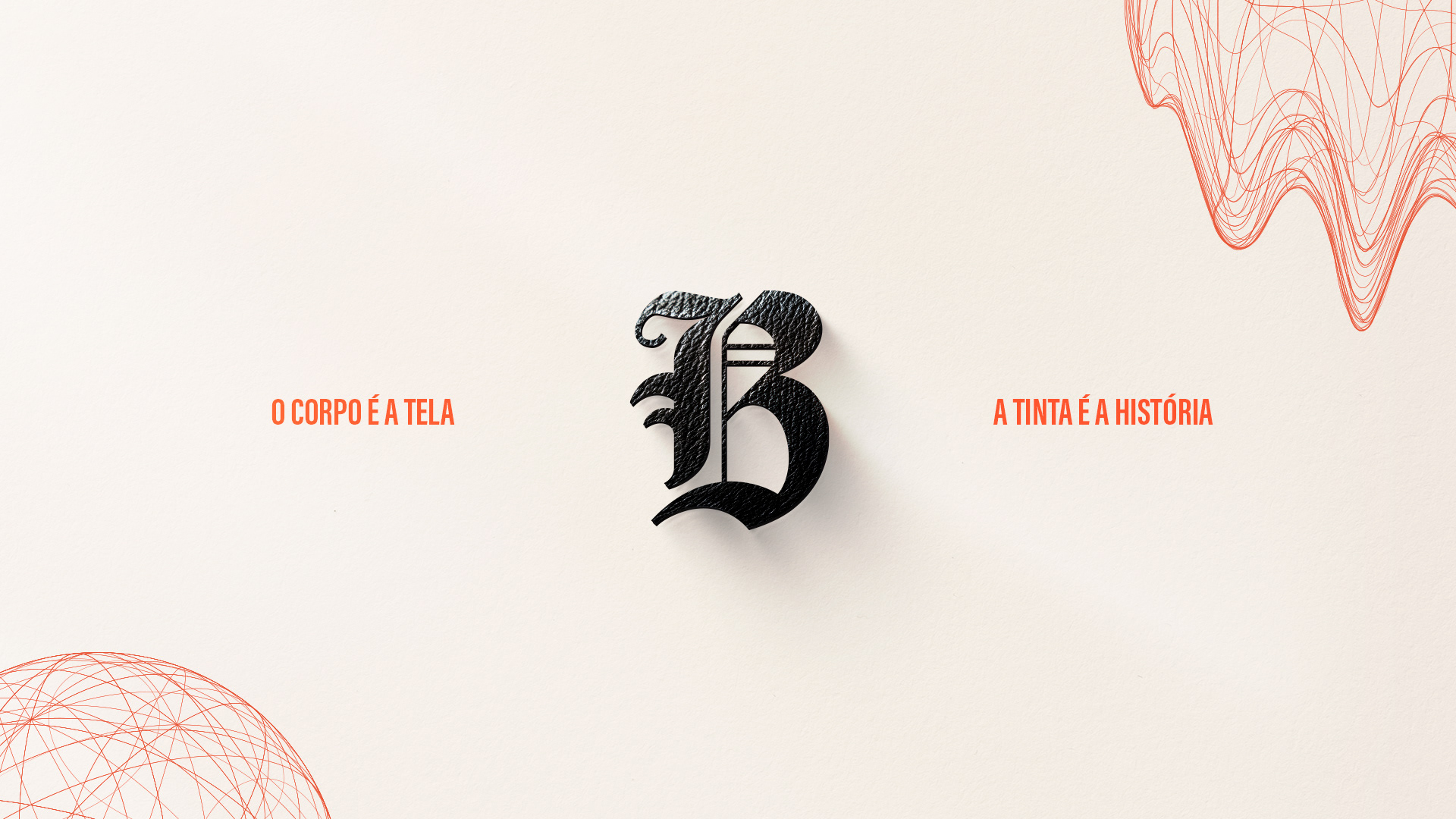
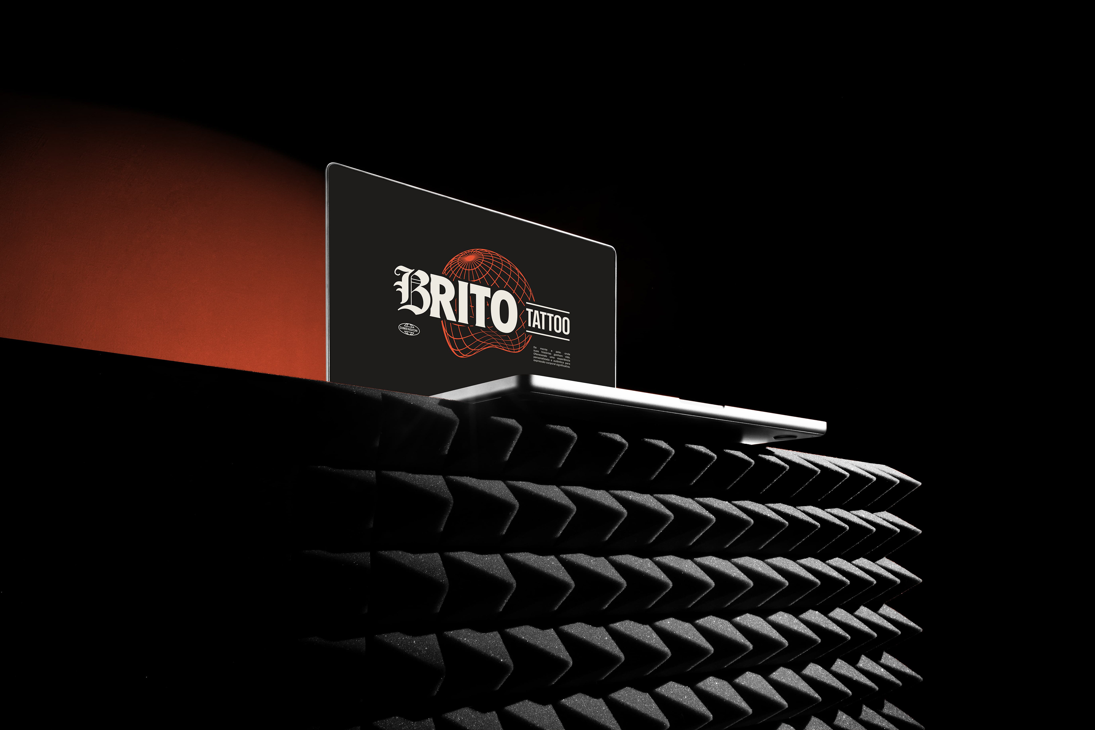
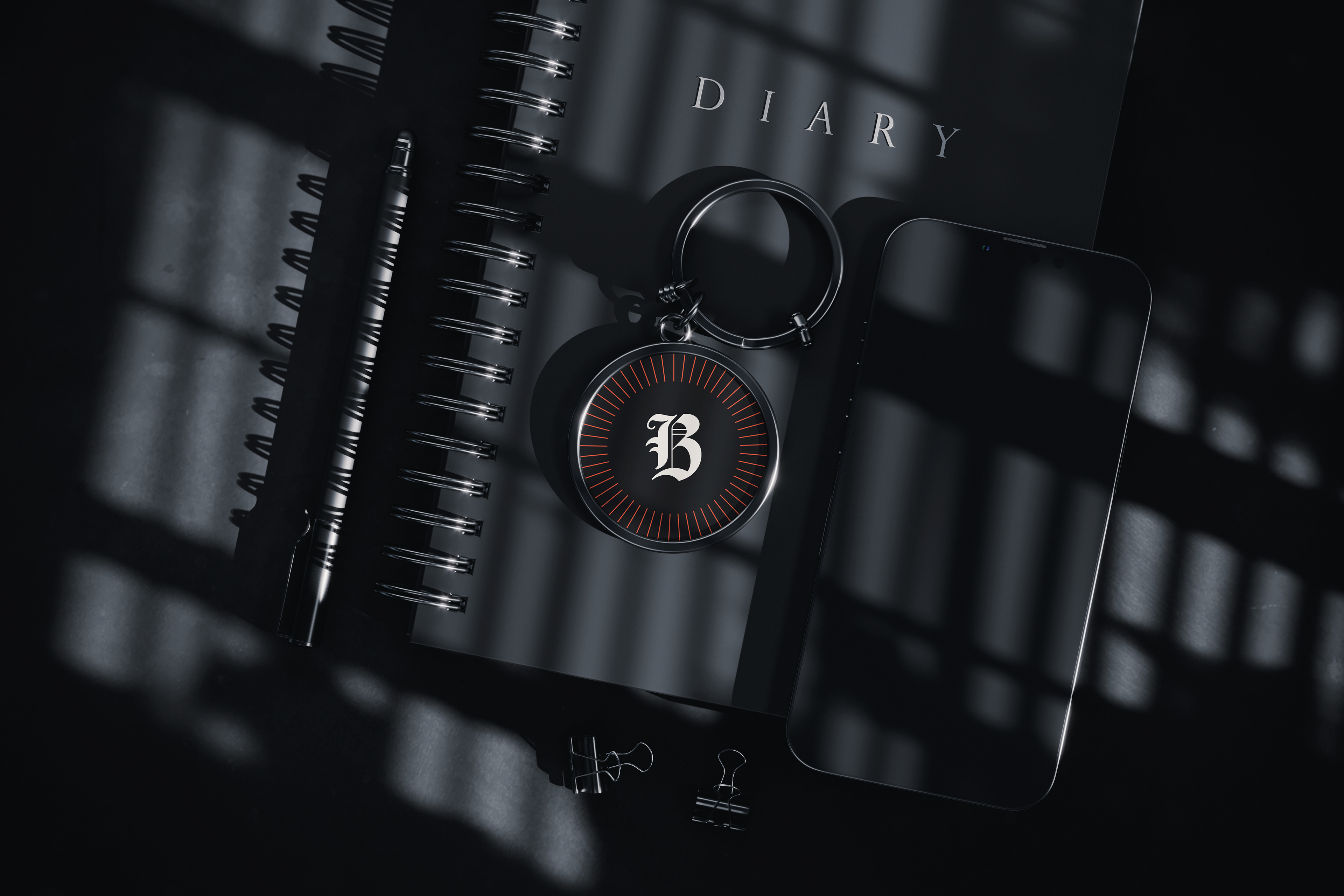
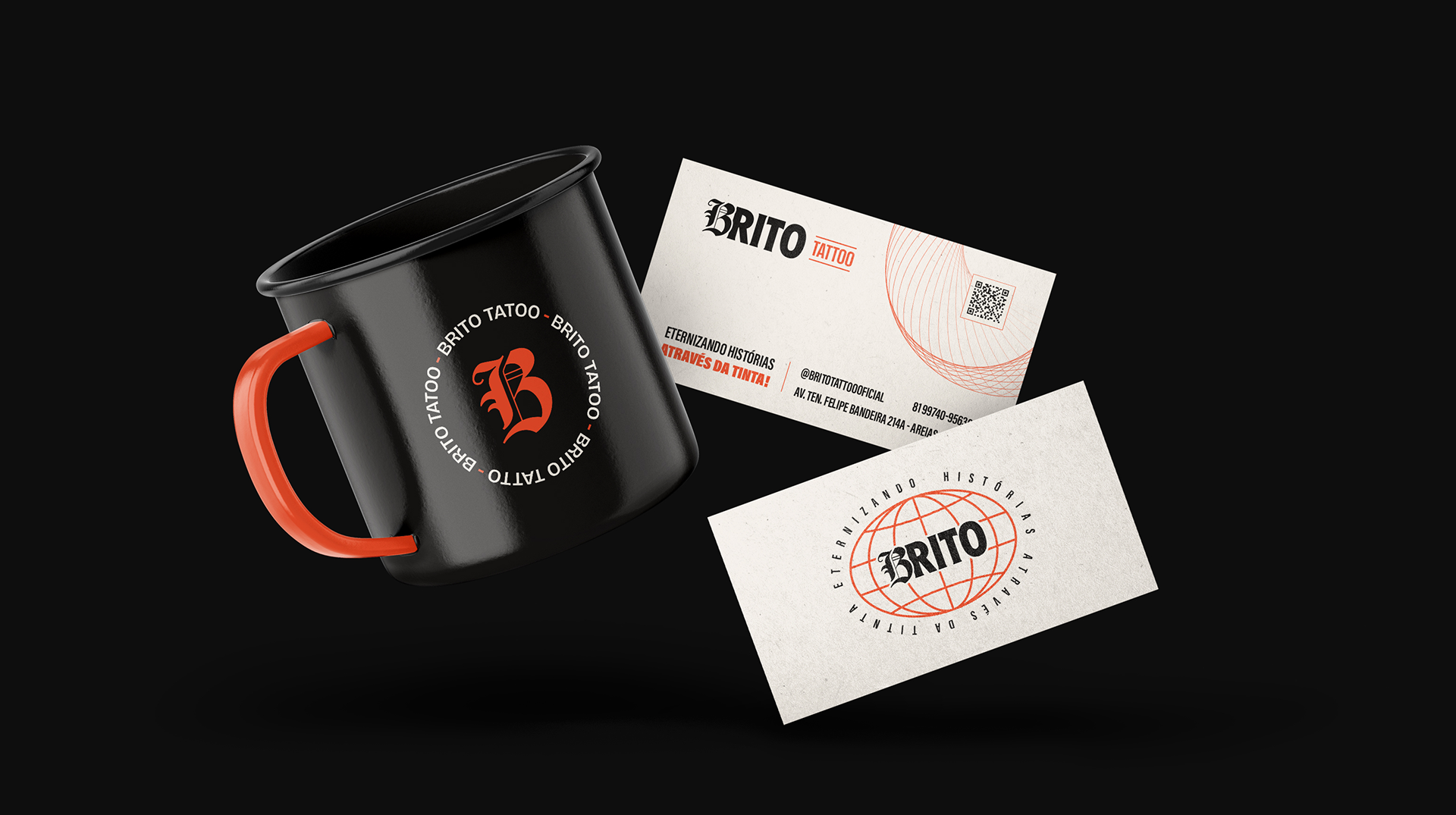
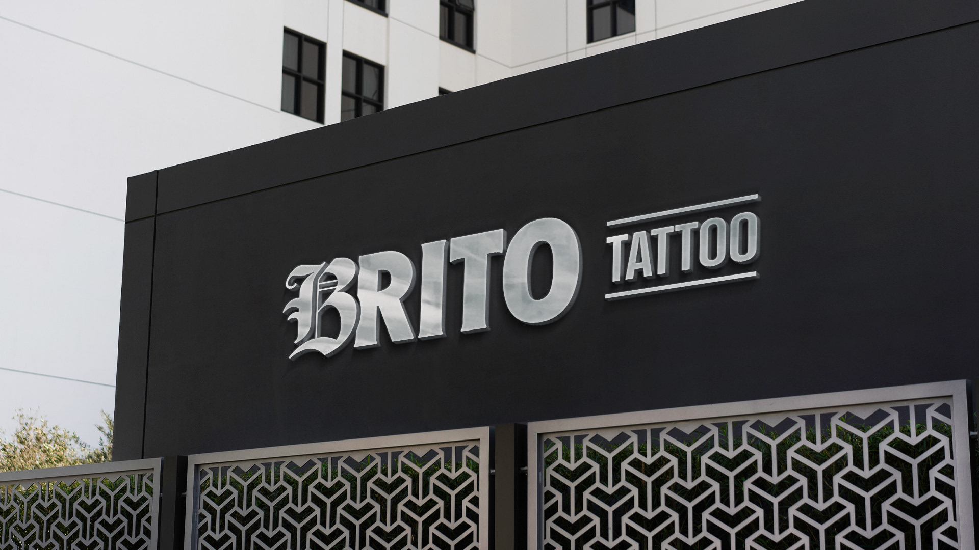
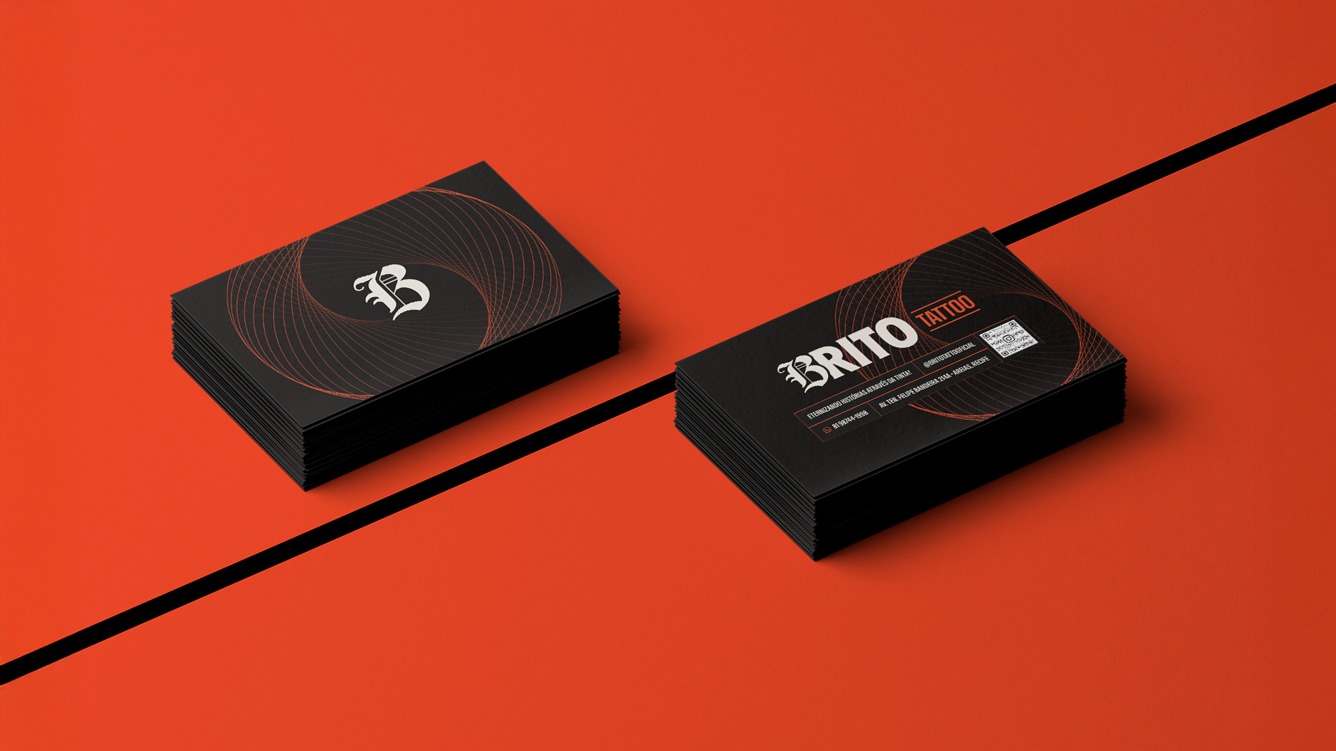
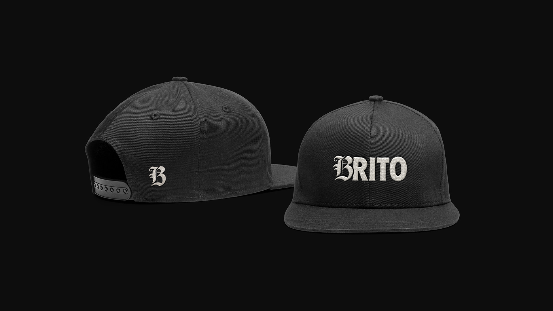
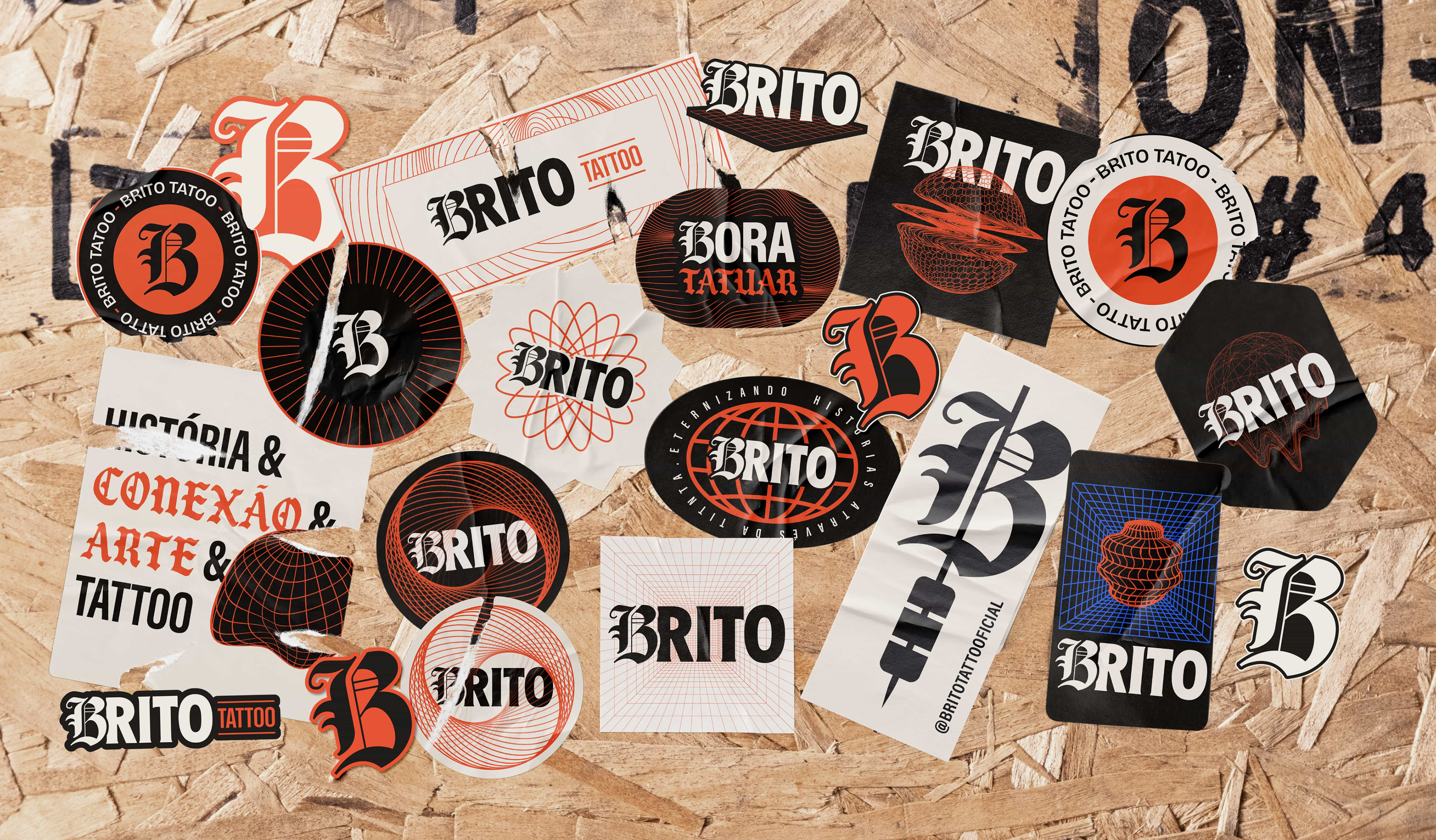
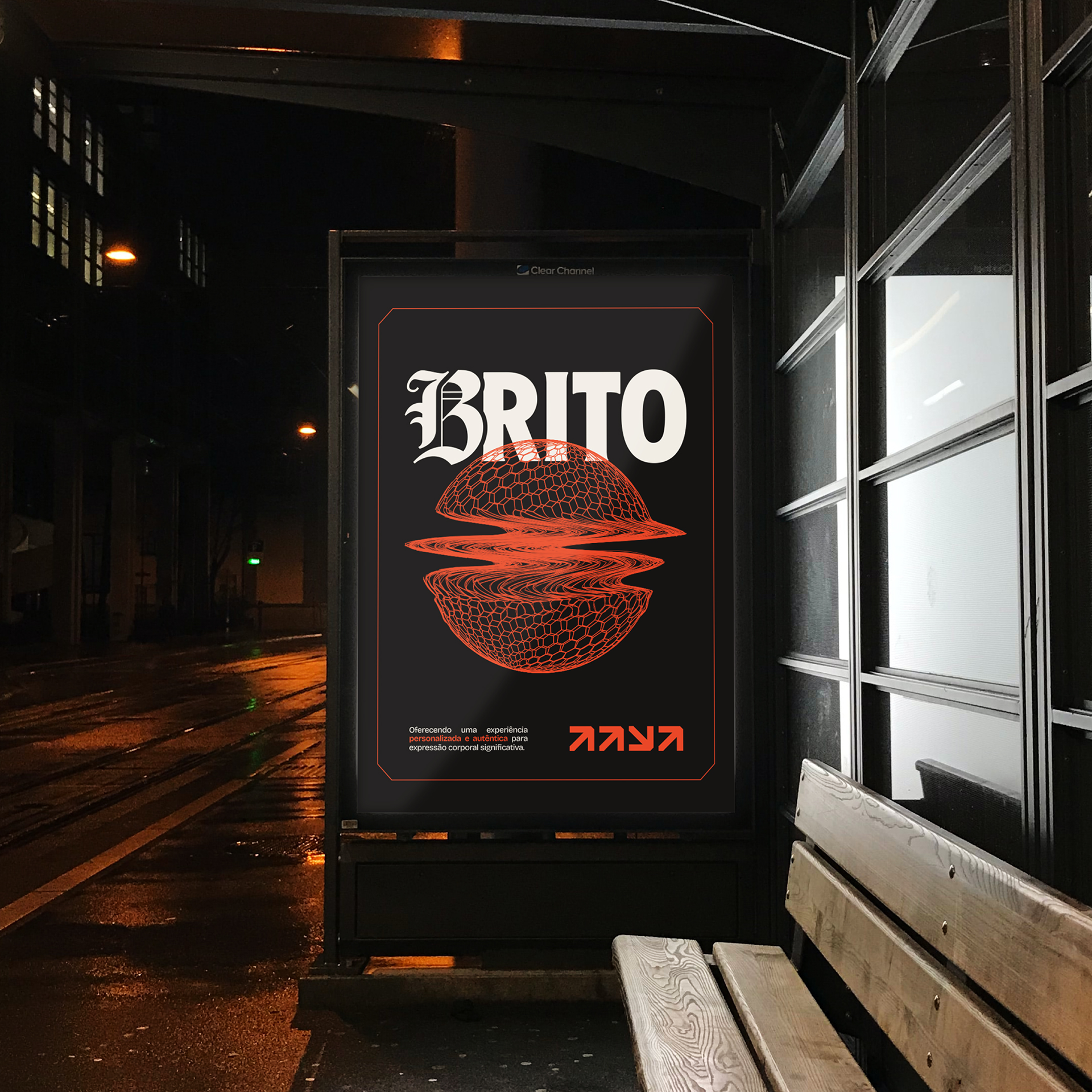
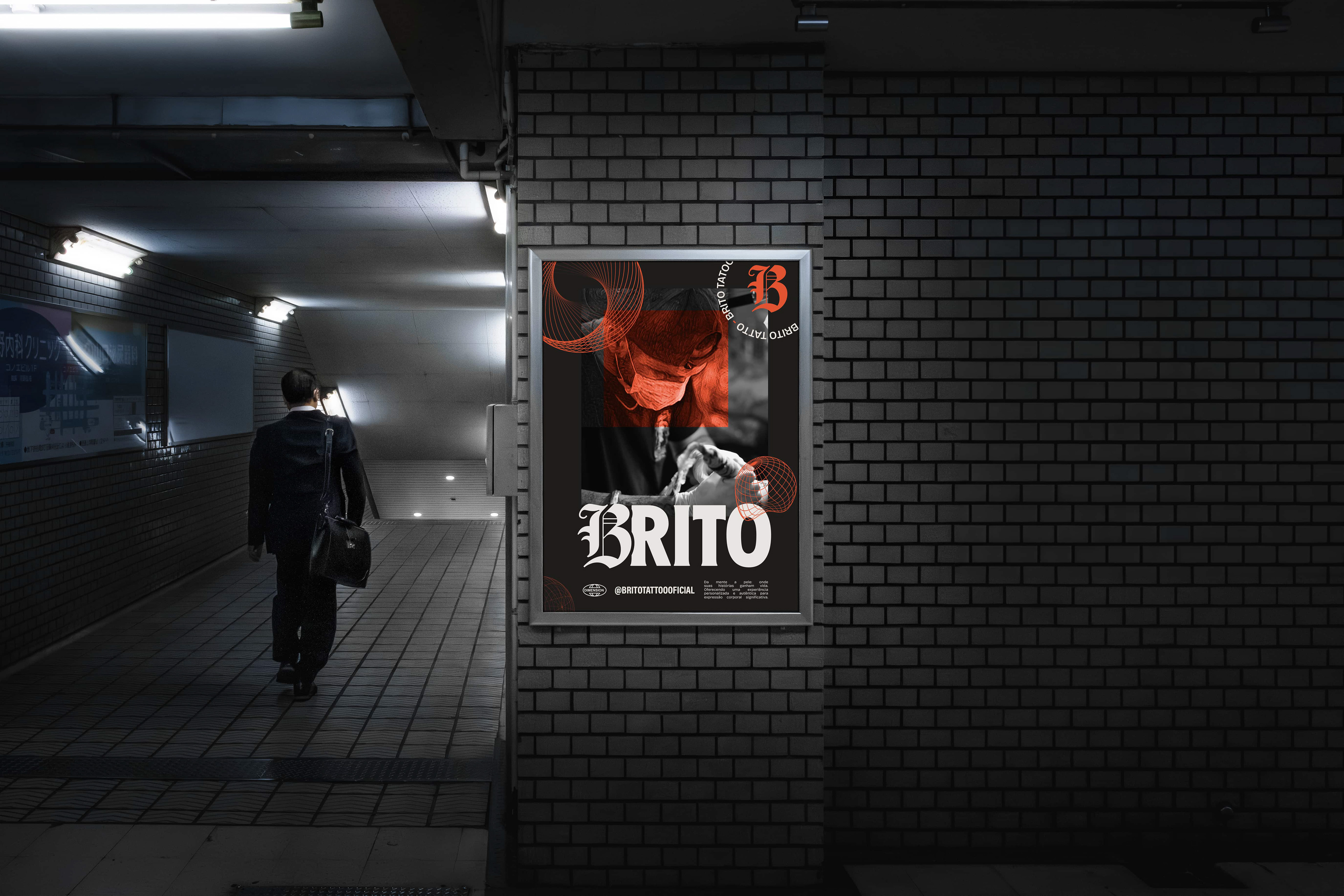
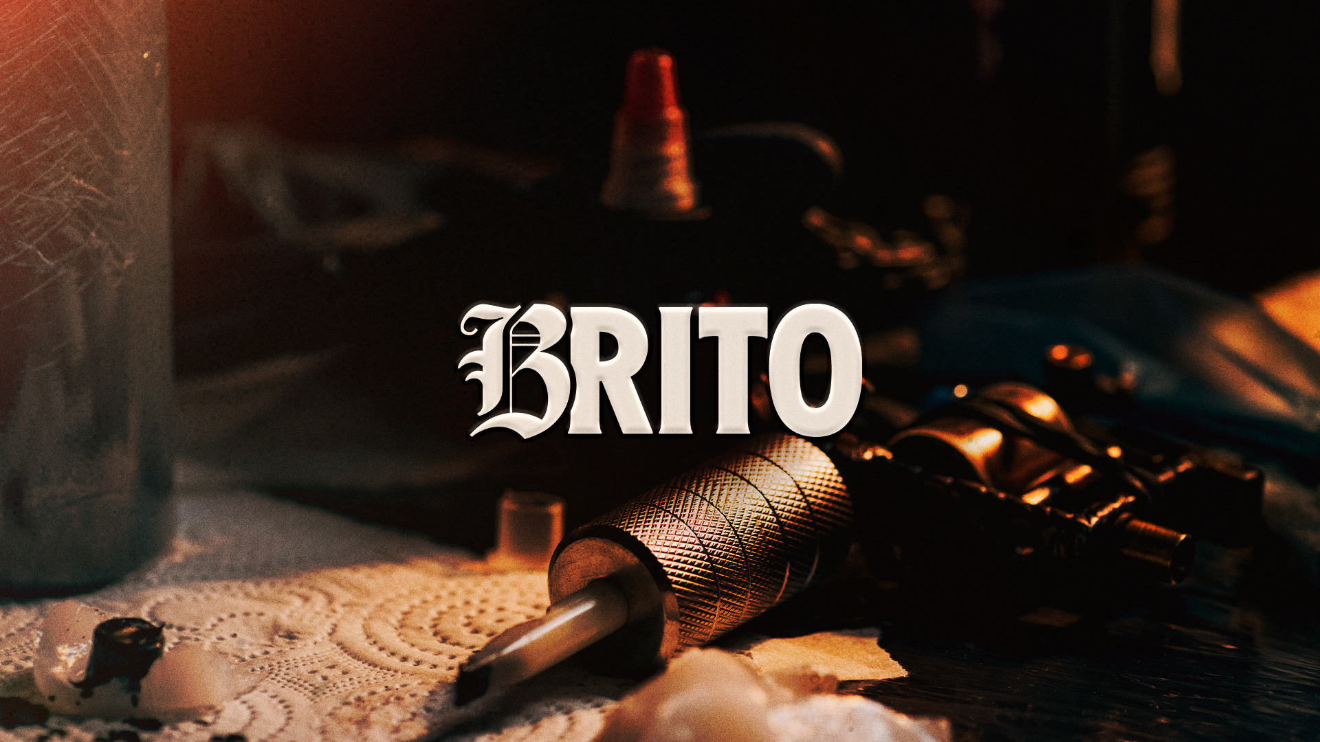
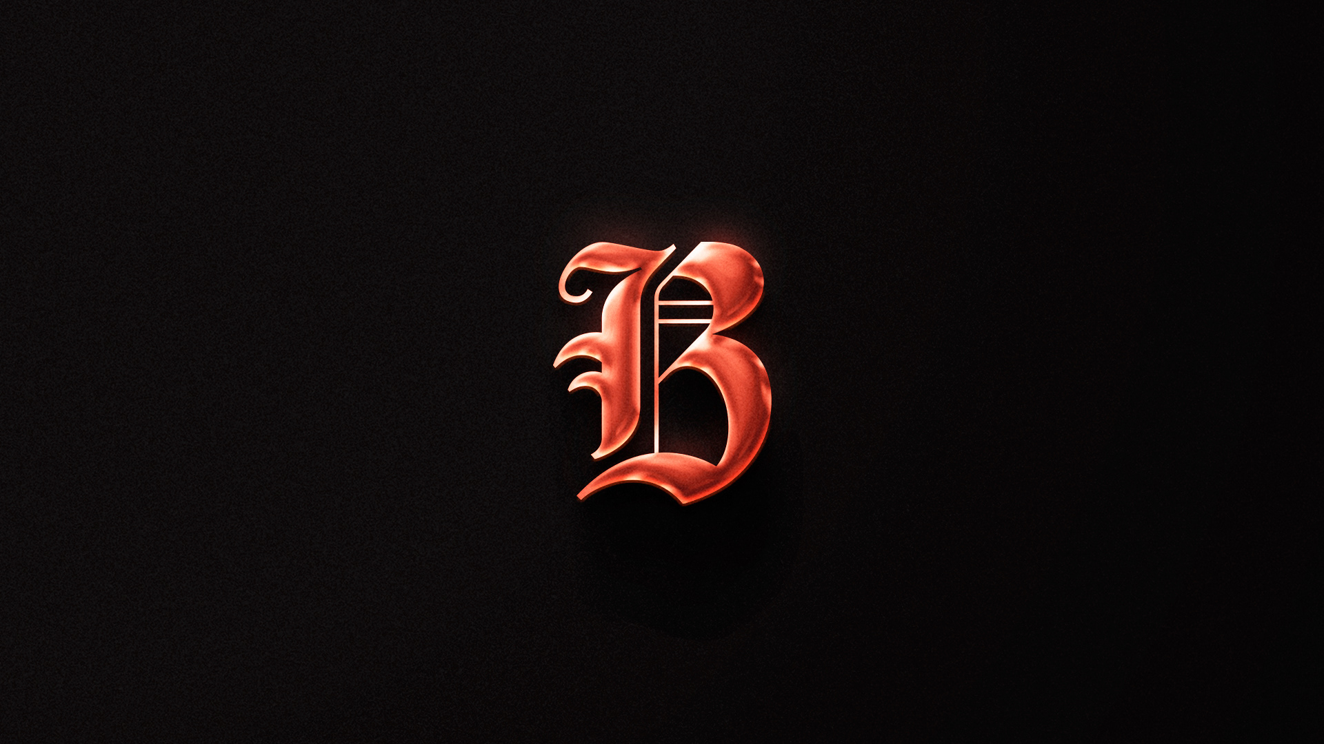
A letra “B” foi criada como símbolo da marca, utilizando como base o estilo Blackletter, carregado de força estética e referência à cultura da tatuagem, do rock, do underground. Representa a arte viva, indomada, visceral, o traço que nasce da alma. Um ícone de ruptura.
Em contraste, o restante da palavra “RITO” utiliza uma tipografia condensada, bold e com leves serifas, transmitindo solidez, autoridade e respeito. Representa o ritual que ancora cada processo criativo, o cuidado, o respeito, o sagrado.
Esse logotipo é mais do que nome. É narrativa visual. Uma fusão entre impulso e intenção, onde o instinto artístico encontra a solidez do ofício.
Esse logotipo é mais do que nome. É narrativa visual. Uma fusão entre impulso e intenção, onde o instinto artístico encontra a solidez do ofício.
[EN]
The Brito Tattoo logotype is born from the contrast between two essential poles of the brand: the artistic and the rational, the rebellious gesture and the firm structure, raw expression and technical mastery.
The letter “B” was crafted as the brand’s symbol, inspired by the Blackletter style — a form loaded with aesthetic power and deeply rooted in tattoo culture, rock, and the underground. It represents living, untamed, visceral art. A stroke that comes from the soul. A true icon of rupture.
In contrast, the remaining part of the word — “RITO” — uses a bold, condensed serif typeface, bringing solidity, authority, and reverence. It represents the ritual that anchors every creative process: the care, the respect, the sacred.
This logo is more than a name. It's visual storytelling — a fusion of impulse and intention, where artistic instinct meets the craft’s structural strength.
IDENTIDADE
[PT]
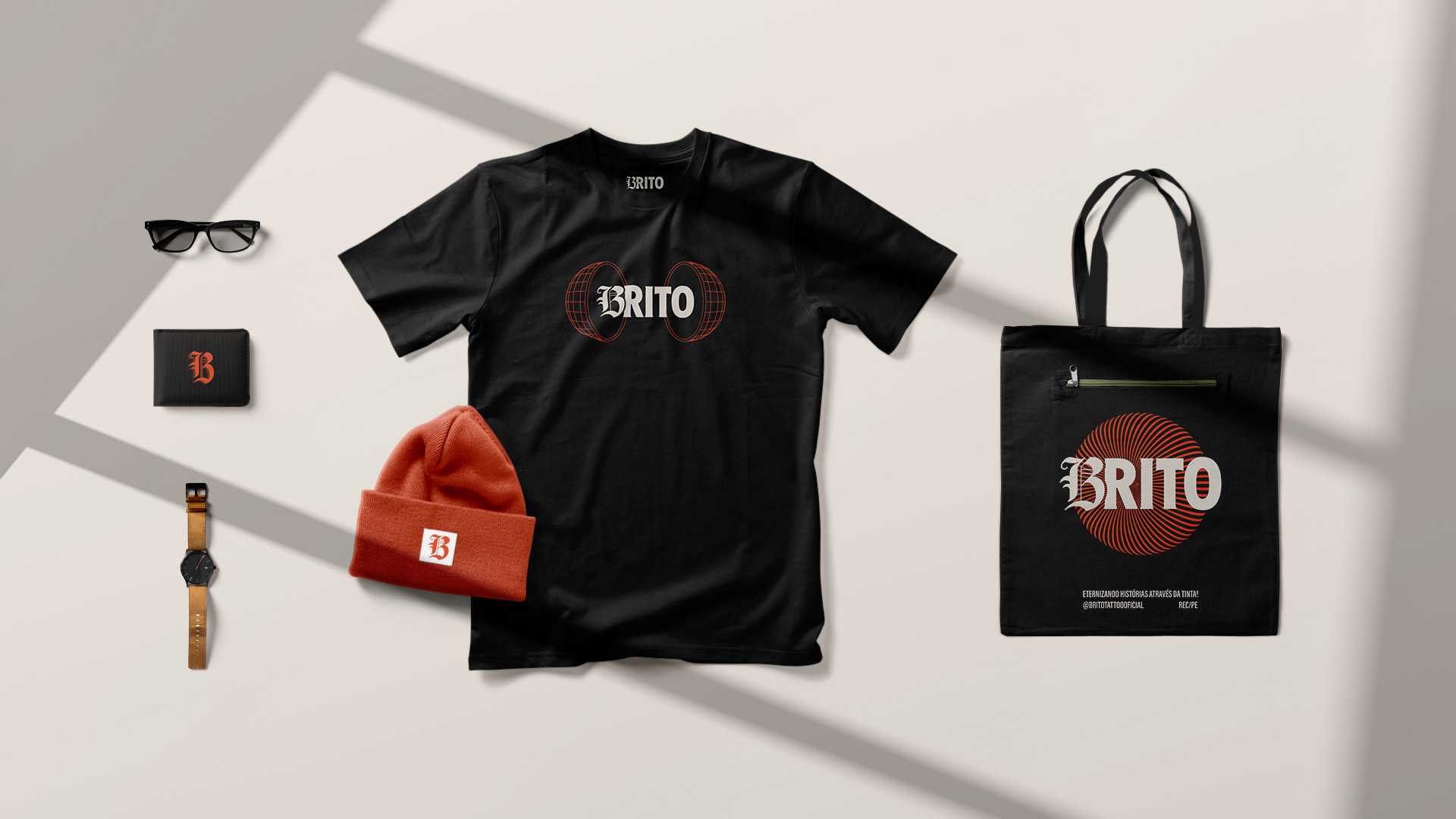
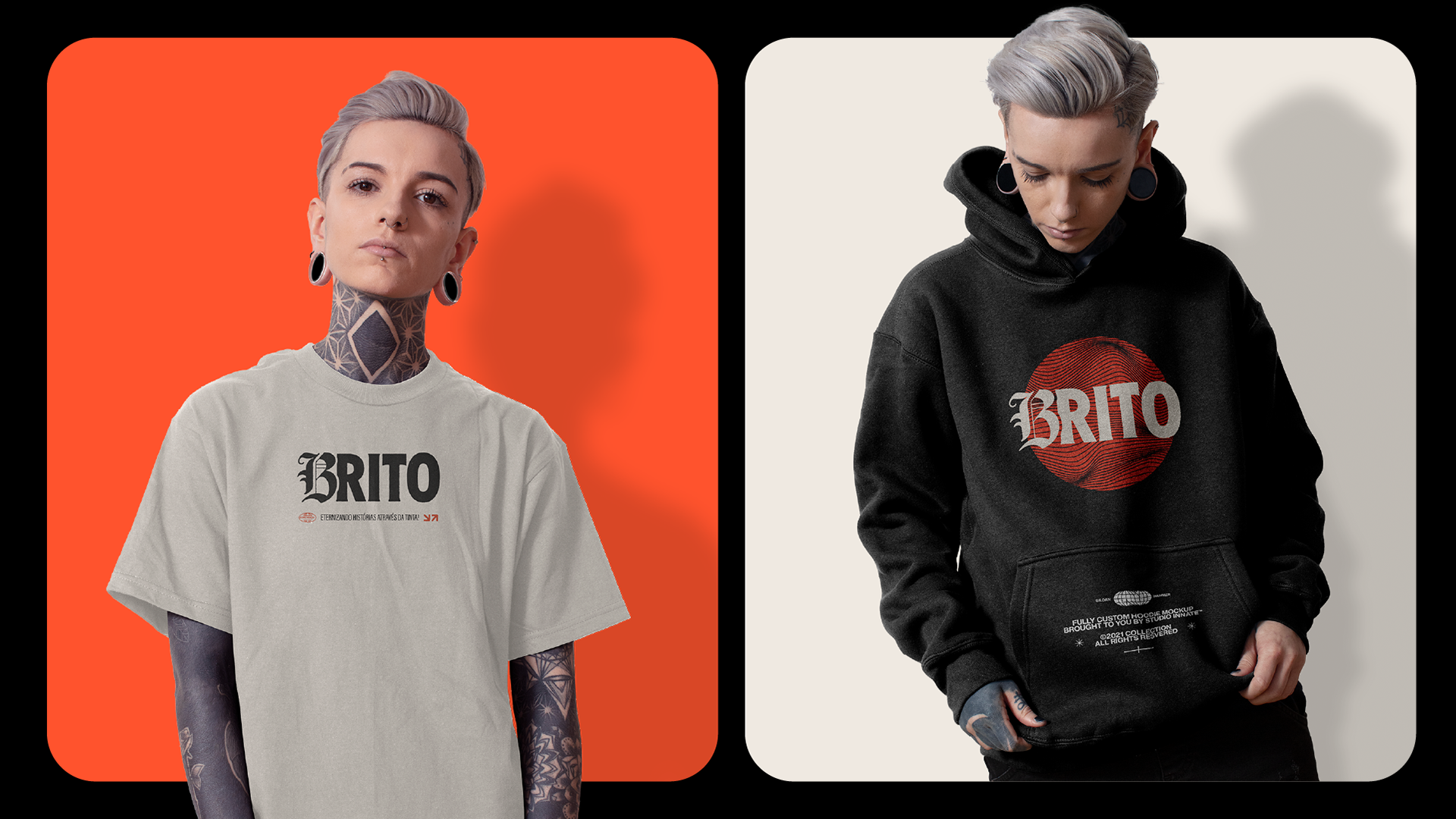
Os tons escolhidos equilibram o calor da pele, a densidade da tinta e a luz do espaço em branco.
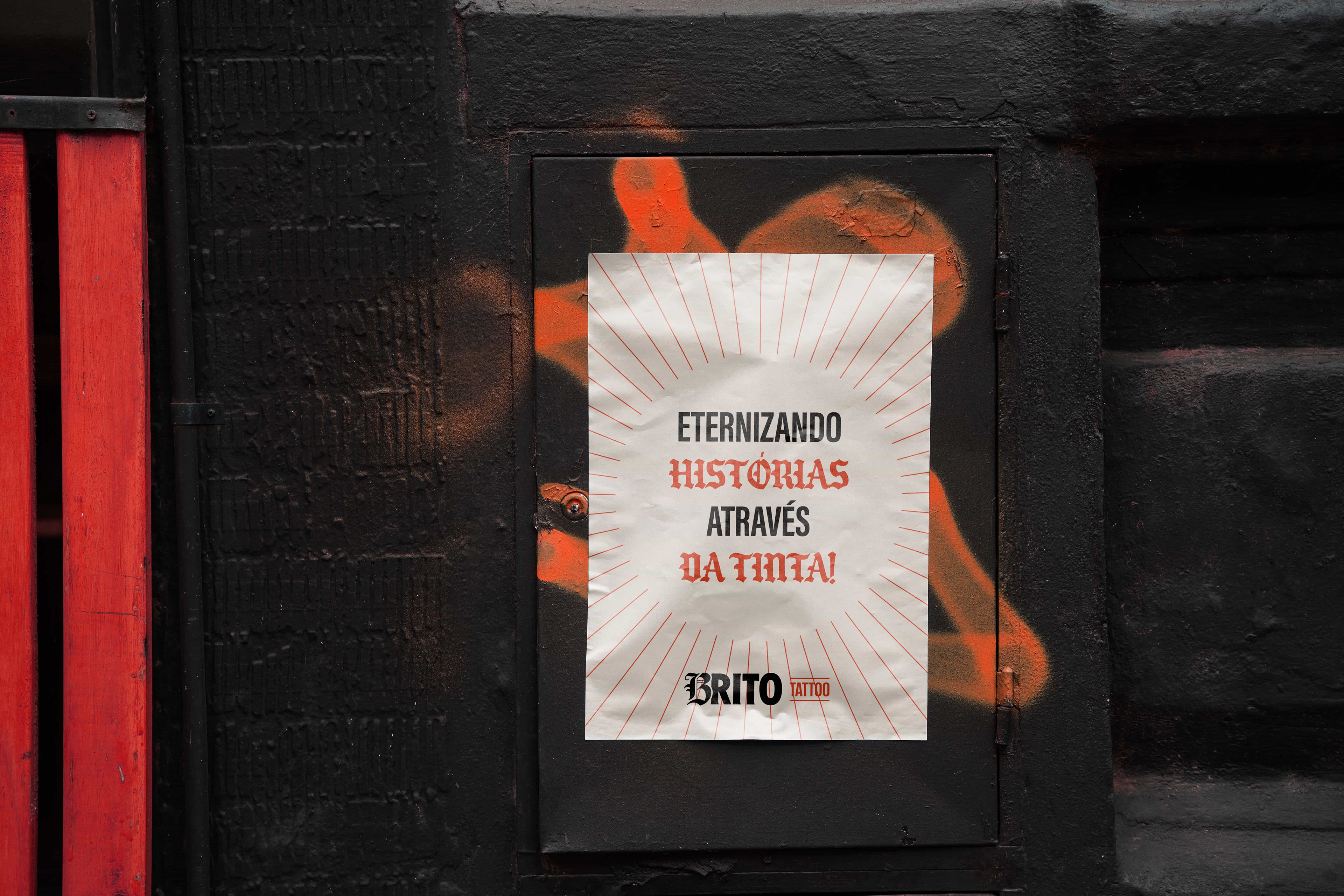
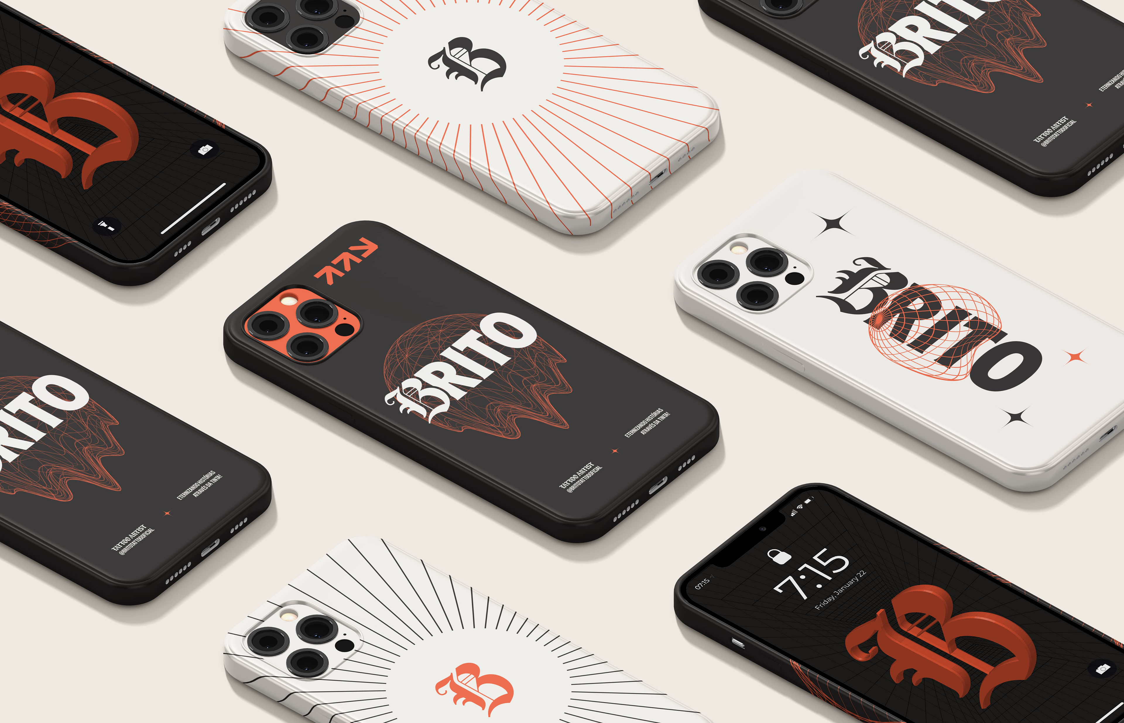
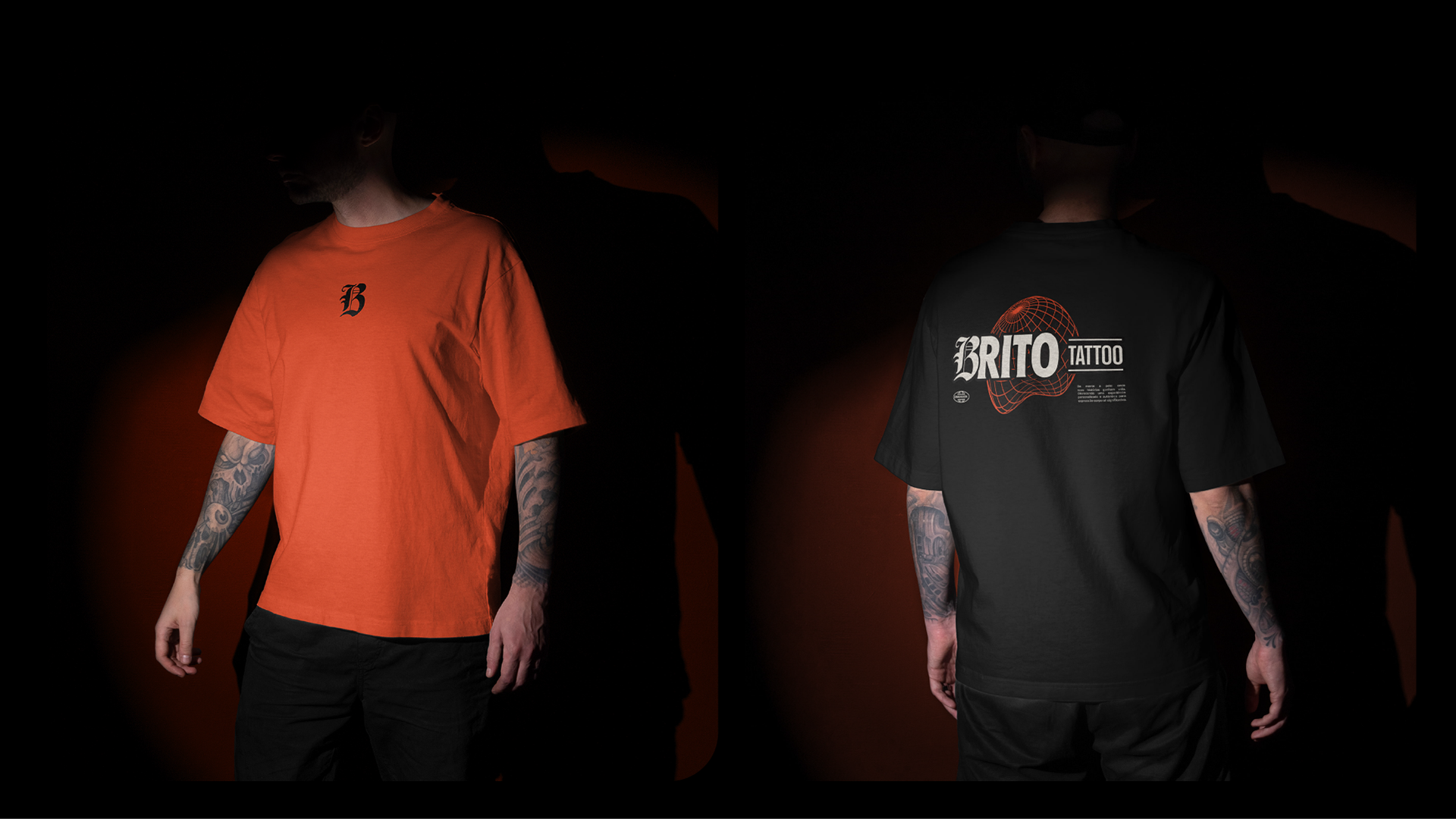
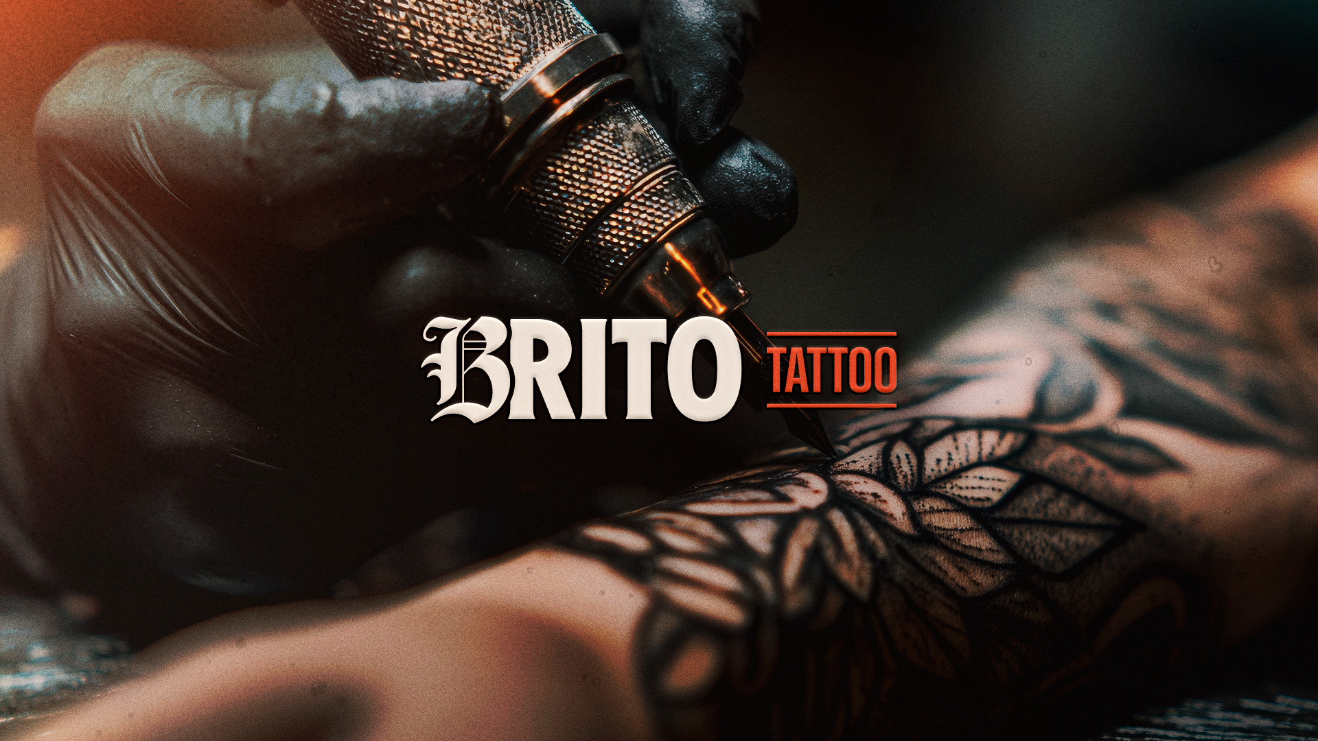
O vermelho intenso expressa energia criativa e movimento.
O preto profundo traduz a presença firme do traço.
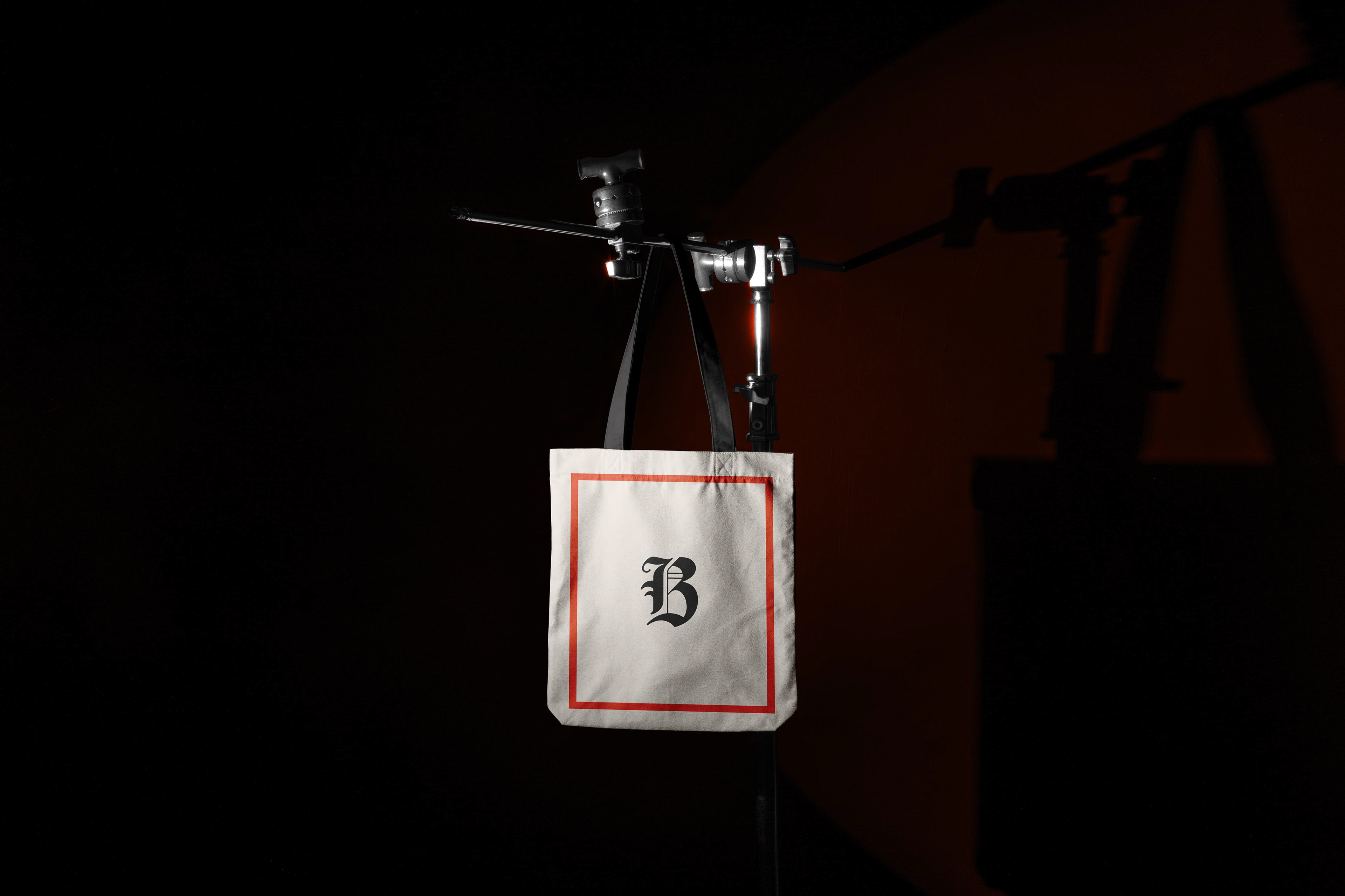
O tom claro suaviza, acolhe e ressignifica.
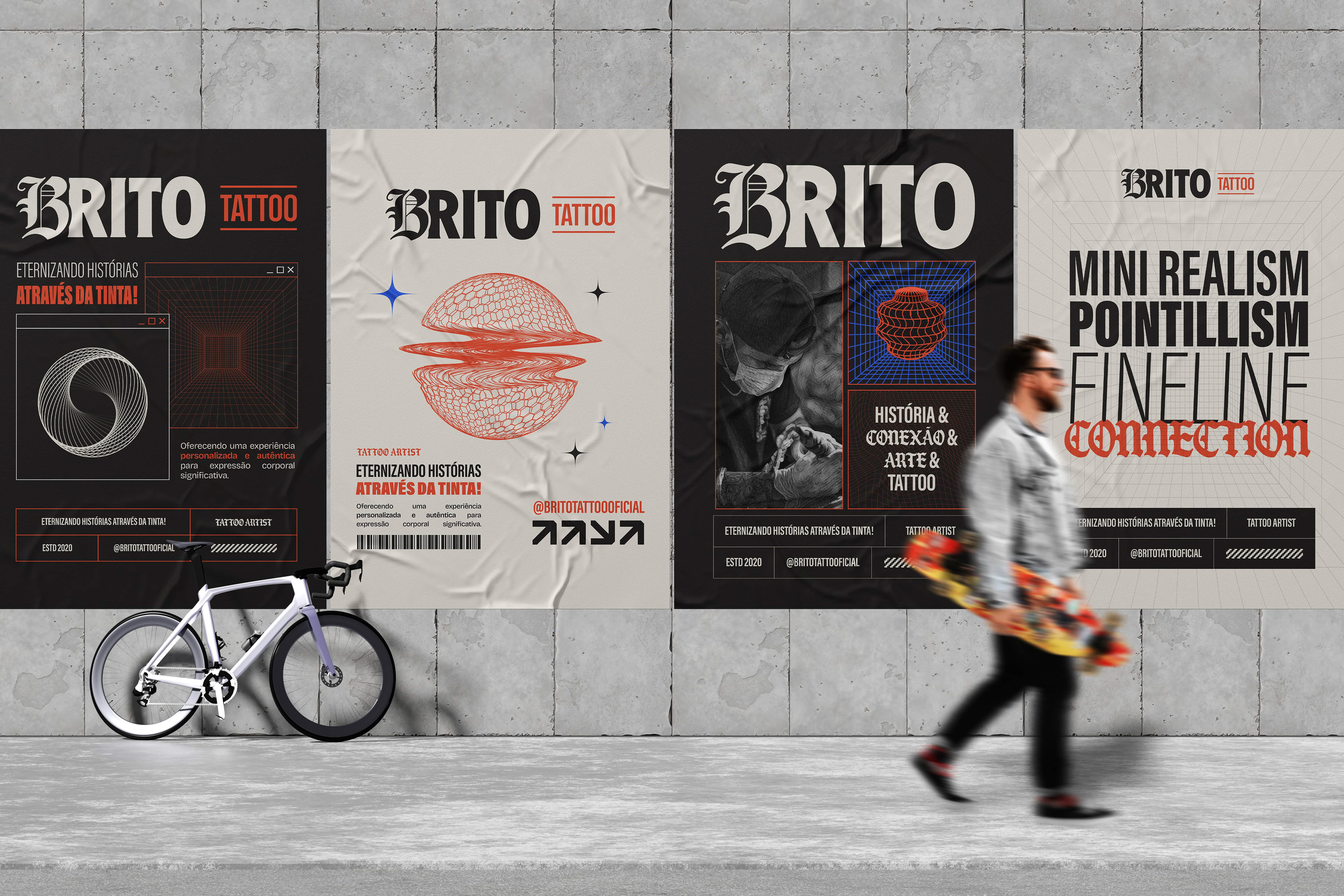
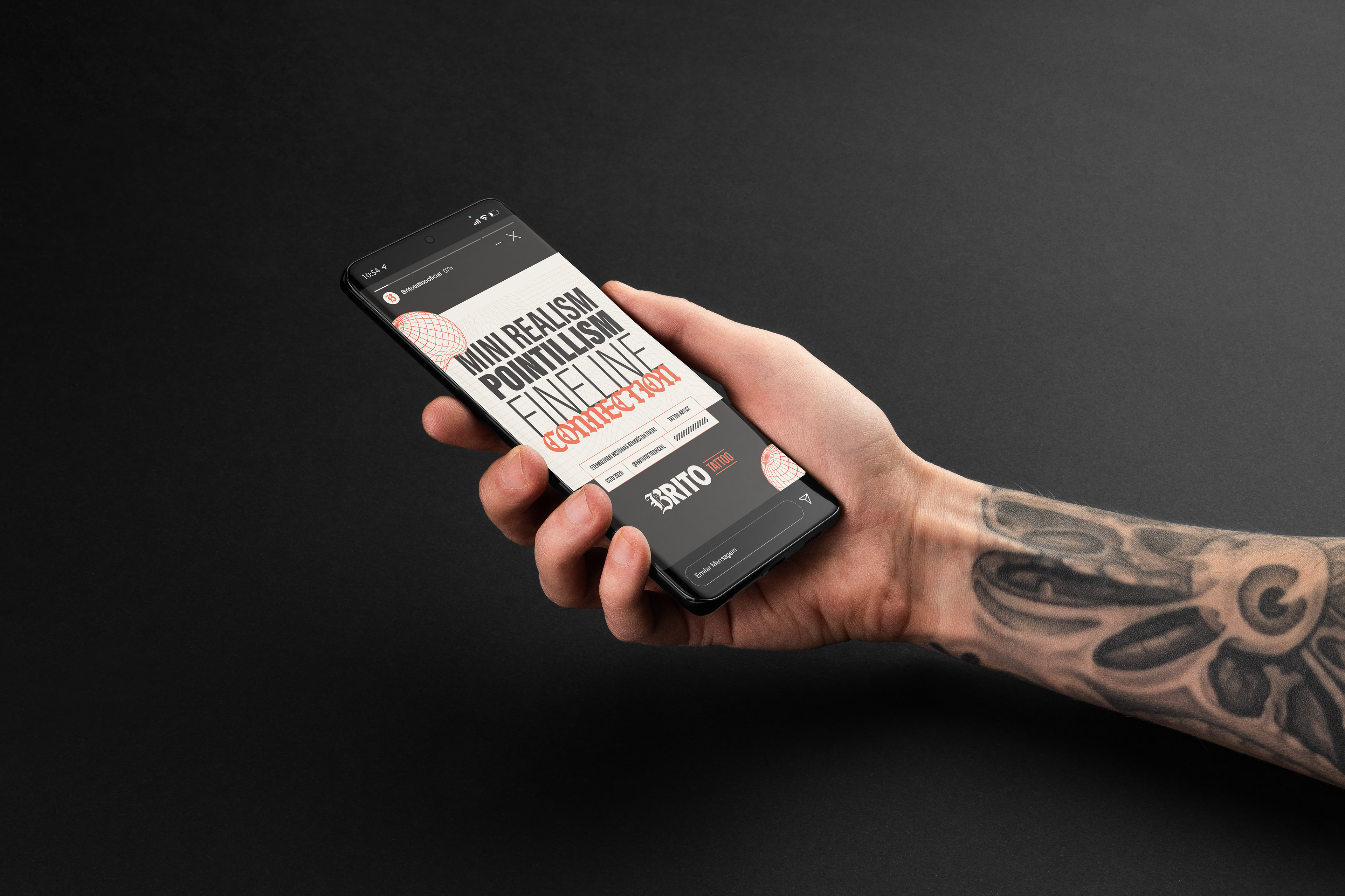
A tipografia acompanha esse mesmo raciocínio visual: impacto nos títulos, personalidade nos detalhes
e fluidez nos textos corridos. Cada letra comunica algo, seja força, escuta ou presença.
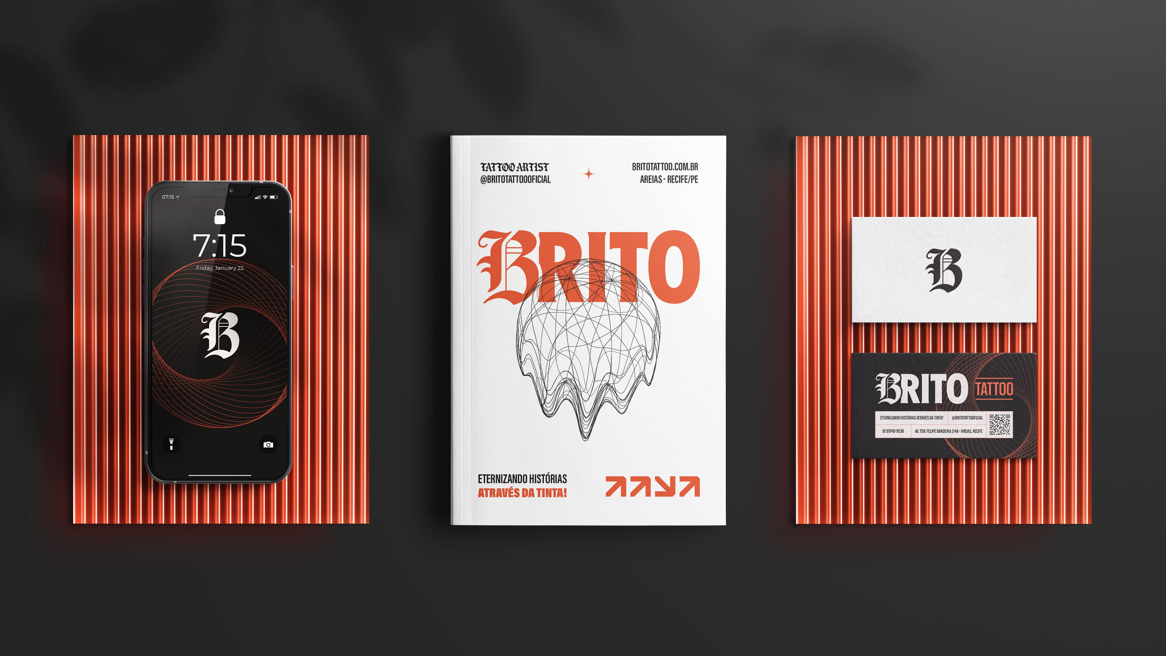
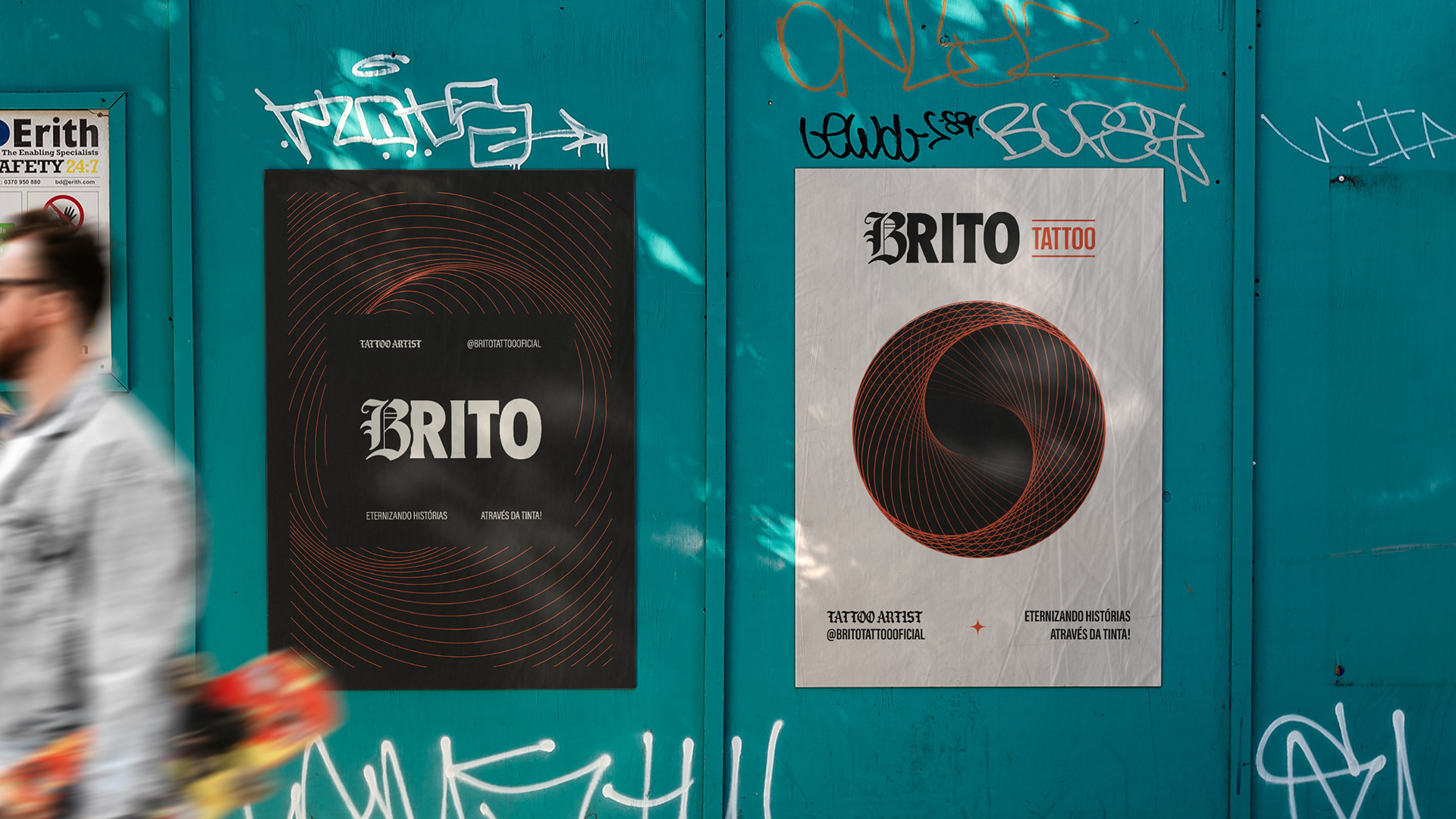
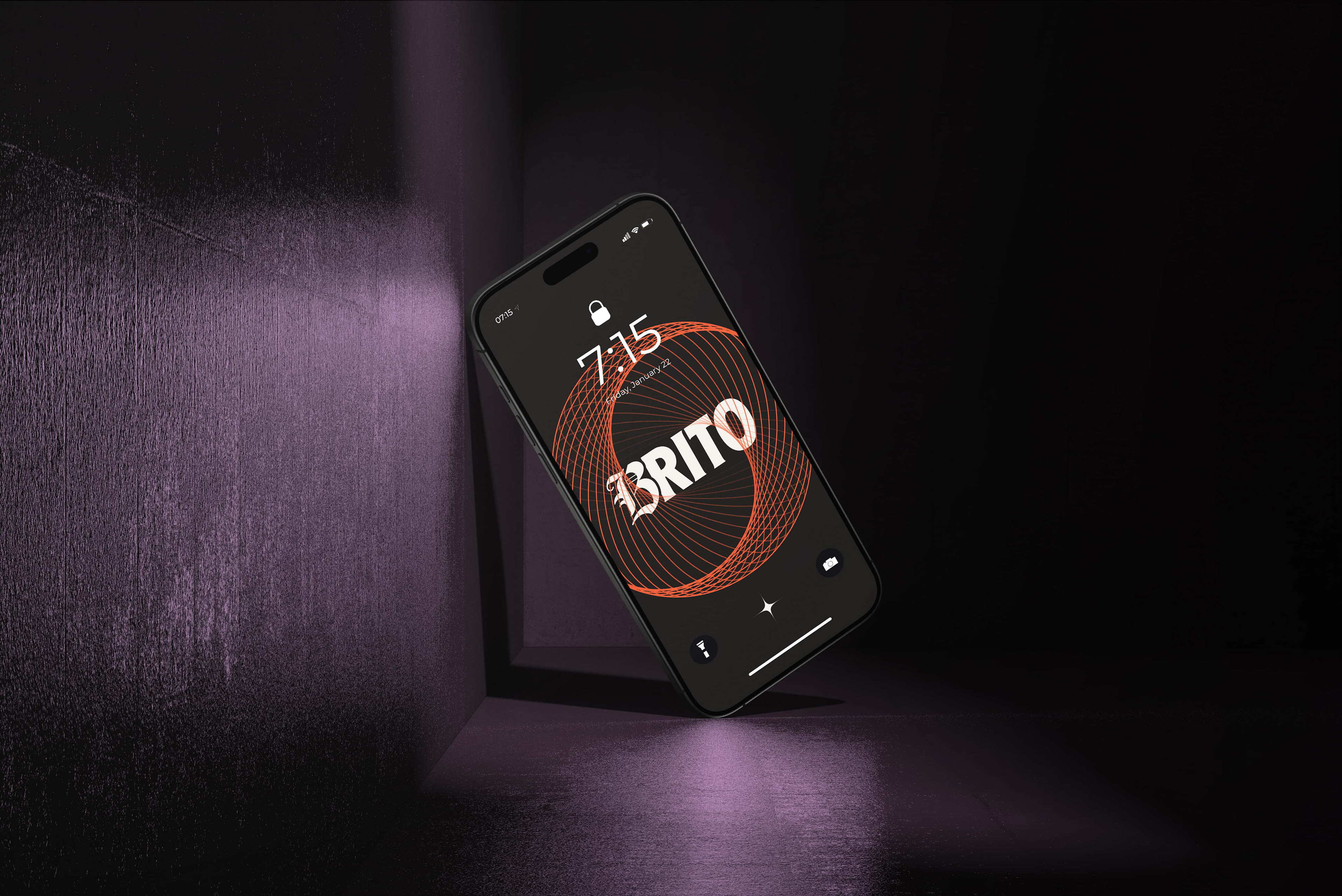
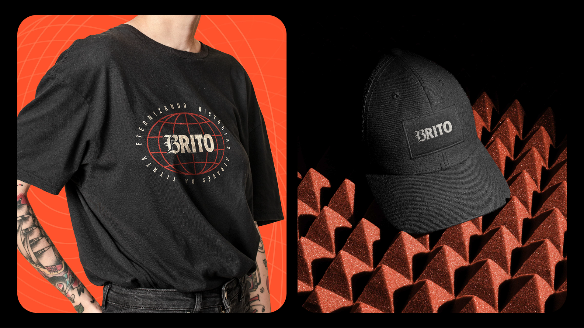
Nos elementos de apoio, a linguagem se desdobra em estruturas geométricas feitas por linhas finas,
inspiradas diretamente no estilo de Gabriel. Esses traços constroem composições tridimensionais que
evocam planejamento, simetria sagrada e precisão.
A identidade visual da Brito Tattoo é, portanto, mais do que uma assinatura.
A identidade visual da Brito Tattoo é, portanto, mais do que uma assinatura.
É um sistema simbólico que traduz o que Gabriel entrega a cada cliente:
presença, escuta, alma e uma arte que permanece.
[EN]
The chosen tones balance the warmth of the skin, the density of the ink, and the light of negative space.
The intense red conveys creative energy and movement.
The deep black reflects the firm presence of the stroke.
The soft light tone embraces, soothes, and redefines.
The deep black reflects the firm presence of the stroke.
The soft light tone embraces, soothes, and redefines.
The typography follows the same visual reasoning: impact in the titles, personality in the details, and fluidity in the body text. Every letter communicates something — whether strength, listening, or presence.
In the supporting elements, the visual language unfolds through fine-lined geometric structures, directly inspired by Gabriel’s artistic style. These strokes build three-dimensional compositions that evoke planning, sacred symmetry, and precision.
Brito Tattoo’s visual identity is more than a signature.
It is a symbolic system that translates what Gabriel delivers to each client: presence, deep listening, soul — and an art that stays.
It is a symbolic system that translates what Gabriel delivers to each client: presence, deep listening, soul — and an art that stays.